
python-highcharts を使って、バックテストで売買した足にフラグを表示してみました。
環境
- jupyter 1.0.0
- numpy 1.15.4
- pandas 0.23.4
- python-highcharts 0.4.2
準備
ここから Jupyter Notebook のセルに入力しながら進めていきます。
モジュールを読み込みます。
import math
import numpy as np
import pandas as pd
from highcharts import Highstock
ヒストリカルデータを読み込みます。
データは Yahoo Finance から予めダウンロードしておきました。
def read(filepath):
    names = ['time', 'open', 'high', 'low', 'close', 'adjclose', 'volume']
    usecols = ['time', 'open', 'high', 'low', 'close', 'volume']
    dtype = { 'time': str, 'open': float, 'high': float, 'low': float, 'close': float, 'volume': float }
    df = pd.read_csv(filepath, header=0, names=names, index_col='time', usecols=usecols, dtype=dtype, parse_dates=['time'])
    return df

df = read('~/historical/^GSPC.csv')
df.head()
df.tail()
バックテスト
以前やったバックテストの関数を使いました。
def test(df, commission=50.0, unit=250):
    df2 = pd.concat([df, df['close'].shift(30 + 1), df['close'].shift(9 + 1), df['close'].shift(1)], axis=1)
    pl = pd.Series(np.full(df2.index.size, np.nan), index=df2.index)
    for row in df2.dropna().itertuples():
        time, open_, high, low, close, value, close2, close3, close4 = row
        if not (close2 < close4 and close4 < close3):
            continue
        p = ((close - open_) * unit - commission)
        p2 = math.floor(p * 100) / 100
        pl[time] = p2
    return pl
2017 年のヒストリカルデータでバックテストをしました。
df2017 = df[df.index.year == 2017]
pl = test(df2017)
pl.dropna().tail()
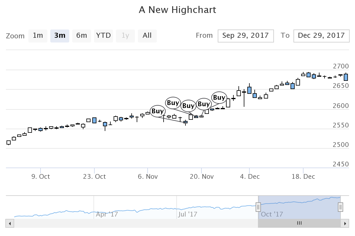
フラグ 1
このデモと同じように表示してみました。
H = Highstock()

r = lambda x: round(x, 2)

ohlc = [[x[0], r(x[1]), r(x[2]), r(x[3]), r(x[4])] for x in df2017.itertuples()]
flags = [{ 'x': x.to_pydatetime(), 'title': 'Buy', 'text': r(y) } for x, y in pl.dropna().iteritems()]

H.add_data_set(ohlc, 'candlestick', 'S&P500', id='dataseries')
H.add_data_set(flags, 'flags', onSeries='dataseries', shape='circlepin', width=16)

H
フラグのデータの x には、 datetime を渡してあげる必要があるみたいでした。
pandas の Timestamp のままじゃダメそうでした。
title はチャート上で見える文字を指定します。
text はカーソルを合わせたときに表示される文字を指定します。
ローソク足のデータを指定しているところの id='dataseries' と、フラグのデータを指定しているところの onSeries='dataseries' を一致させることで、ローソク足にくっつくようにフラグを表示してくれるみたいです。
結果です。
フラグ 2
上の例だと、ローソク足の終値にフラグがくっつく形になります。
これだとローソク足自体が見づらいかもしれません。
onSeries='dataseries' を指定しないとフラグはチャートの下側に表示されます。
H = Highstock()

r = lambda x: round(x, 2)

ohlc = [[x[0], r(x[1]), r(x[2]), r(x[3]), r(x[4])] for x in df2017.itertuples()]
flags = [{ 'x': x.to_pydatetime(), 'title': 'Buy', 'text': r(y) } for x, y in pl.dropna().iteritems()]

H.add_data_set(ohlc, 'candlestick', 'S&P500')
H.add_data_set(flags, 'flags')

H
結果です。
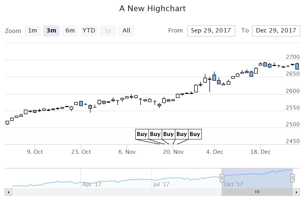
こちらの方が見づらいこともあるかもしれません。 使い分けてあげる必要がありそうかな。
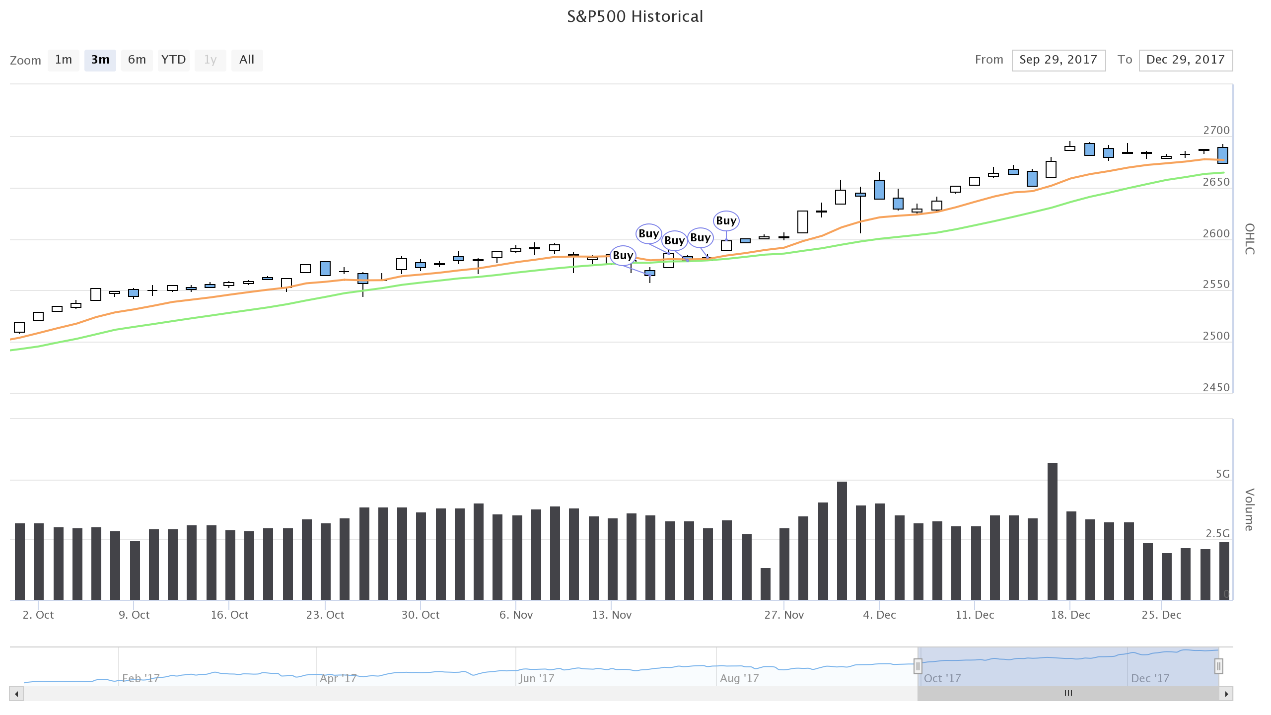
出来高とインディケーターとフラグ
前回の出来高とインディケーターも一緒に表示してみました。
H = Highstock()

groupingUnits = [
    ['week', [1]],
    ['month', [1, 2, 3, 4, 6]]
]

ohlc = [[x[0], r(x[1]), r(x[2]), r(x[3]), r(x[4])] for x in df2017.itertuples()]
volume = [[x[0], r(x[5])] for x in df2017.itertuples()]
sma = [[x[0], r(x[4])] for x in df2017.rolling(window=20).mean().itertuples()]
ema = [[x[0], r(x[4])] for x in df2017.ewm(span=10).mean().itertuples()]
flags = [{ 'x': x.to_pydatetime(), 'title': 'Buy', 'text': r(y) } for x, y in pl.dropna().iteritems()]

options = {
    'rangeSelector': {
        'selected': 1
    },
    'title': {
        'text': 'S&P500 Historical'
    },
    'yAxis': [{
        'labels': {
            'align': 'right',
            'x': -3
        },
        'title': {
            'text': 'OHLC'
        },
        'height': '60%',
        'lineWidth': 2
    },
    {
        'labels': {
            'align': 'right',
            'x': -3
        },
        'title': {
            'text': 'Volume'
        },
        'top': '65%',
        'height': '35%',
        'offset': 0,
        'lineWidth': 2
    }],
    'chart': {
        'height': 720,
        'width': 1280,
    },
}

H.add_data_set(ohlc, 'candlestick', 'S&P500', dataGrouping={ 'units': groupingUnits }, id='dataseries')
H.add_data_set(volume, 'column', 'Volume', yAxis=1, dataGrouping={ 'units': groupingUnits })
H.add_data_set(sma, 'line', 'SMA (20)', dataGrouping={ 'units': groupingUnits })
H.add_data_set(ema, 'line', 'EMA (10)', dataGrouping={ 'units': groupingUnits })
H.add_data_set(flags, 'flags', onSeries='dataseries', shape='circlepin', width=16)
H.set_dict_options(options)

H
結果です。
終わり
このバックテストの売買ルールは買った足と売った足が同じなのでフラグも一つで十分でした。
買った足と売った足が違う場合はフラグのデータの配列を 2 つ作ってあげて、それぞれ H.add_data_set([], 'flags') に指定してあげれば良さそうです。
Gist に Jupyter Notebook のファイルをアップロードしておきました。