
python-highcharts を使って、ローソク足と出来高とインディケーターを表示してみました。
環境
- jupyter 1.0.0
- pandas 0.23.4
- python-highcharts 0.4.2
準備
ここから Jupyter Notebook のセルに入力しながら進めていきます。
モジュールを読み込みます。
import math
import pandas as pd
from highcharts import Highstock
ヒストリカルデータを読み込みます。
データは Yahoo Finance から予めダウンロードしておきました。
def read(filepath):
    names = ['time', 'open', 'high', 'low', 'close', 'adjclose', 'volume']
    usecols = ['time', 'open', 'high', 'low', 'close', 'volume']
    dtype = { 'time': str, 'open': float, 'high': float, 'low': float, 'close': float, 'volume': float }
    df = pd.read_csv(filepath, header=0, names=names, index_col='time', usecols=usecols, dtype=dtype, parse_dates=['time'])
    return df

df = read('~/historical/^GSPC.csv')
df.head()
df.tail()
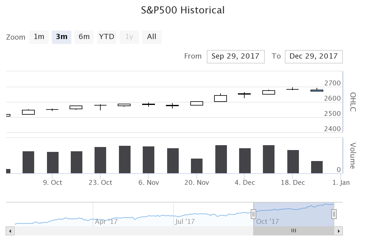
出来高
ローソク足と出来高を表示します。 このデモをほぼそのまま実装してみました。 これは Highcharts のデモと同じように実装しているようでした。
H = Highstock()

r = lambda x: round(x, 2)
df2017 = df[df.index.year == 2017]
groupingUnits = [
    ['week', [1]],
    ['month', [1, 2, 3, 4, 6]]
]

ohlc = [[x[0], r(x[1]), r(x[2]), r(x[3]), r(x[4])] for x in df2017.itertuples()]
volume = [[x[0], r(x[5])] for x in df2017.itertuples()]
options = {
    'rangeSelector': {
        'selected': 1
    },
    'title': {
        'text': 'S&P500 Historical'
    },
    'yAxis': [{
        'labels': {
            'align': 'right',
            'x': -3
        },
        'title': {
            'text': 'OHLC'
        },
        'height': '60%',
        'lineWidth': 2
    },
    {
        'labels': {
            'align': 'right',
            'x': -3
        },
        'title': {
            'text': 'Volume'
        },
        'top': '65%',
        'height': '35%',
        'offset': 0,
        'lineWidth': 2
    }],
}

H.add_data_set(ohlc, 'candlestick', 'S&P500', dataGrouping={ 'units': groupingUnits })
H.add_data_set(volume, 'column', 'Volume', yAxis=1, dataGrouping={ 'units': groupingUnits })
H.set_dict_options(options)

H
options['yAxis'] にある配列の要素を 2 つ指定してあげると、 Y 軸を 2 つにすることができるみたいです。
出来高のデータを設定している H.add_data_set() のところで yAxis=1 のように指定してあげると、 Y 軸の 2 つ目に出来高を表示してくれるみたいです。
出来高のデータも二次元配列で作ってあげる必要があるみたいでした。 インデックスの 0 は日時、インデックスの 1 は出来高を指定してあげました。
結果です。
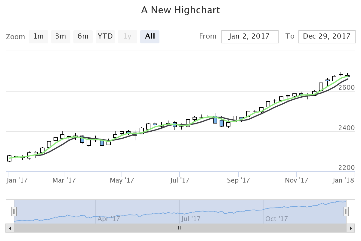
インディケーター
ローソク足にインディケーターを表示してみました。
H = Highstock()

ohlc = [[x[0], r(x[1]), r(x[2]), r(x[3]), r(x[4])] for x in df2017.itertuples()]
sma = [[x[0], r(x[4])] for x in df2017.rolling(window=20).mean().itertuples()]
ema = [[x[0], r(x[4])] for x in df2017.ewm(span=10).mean().itertuples()]

H.add_data_set(ohlc, 'candlestick', 'S&P500')
H.add_data_set(sma, 'line', 'SMA (20)')
H.add_data_set(ema, 'line', 'EMA (10)')

H
Highcharts のデモを見ると、 SMA は自分で計算しなくても OHLC のデータから自動的に計算してくれることもできるみたいでした。 でも python-highcharts のデモから同じような実装を見つけることができませんでした。
だから Pandas で計算しました。
Pandas は簡単に SMA や EMA を計算することができて便利です。
DataFrame.rolling().mean() で SMA 、 DataFrame.ewm().mean() で EMA を計算しました。
それらを H.add_data_set([], 'line') のように Highcharts に渡してあげるようにしました。
結果です。
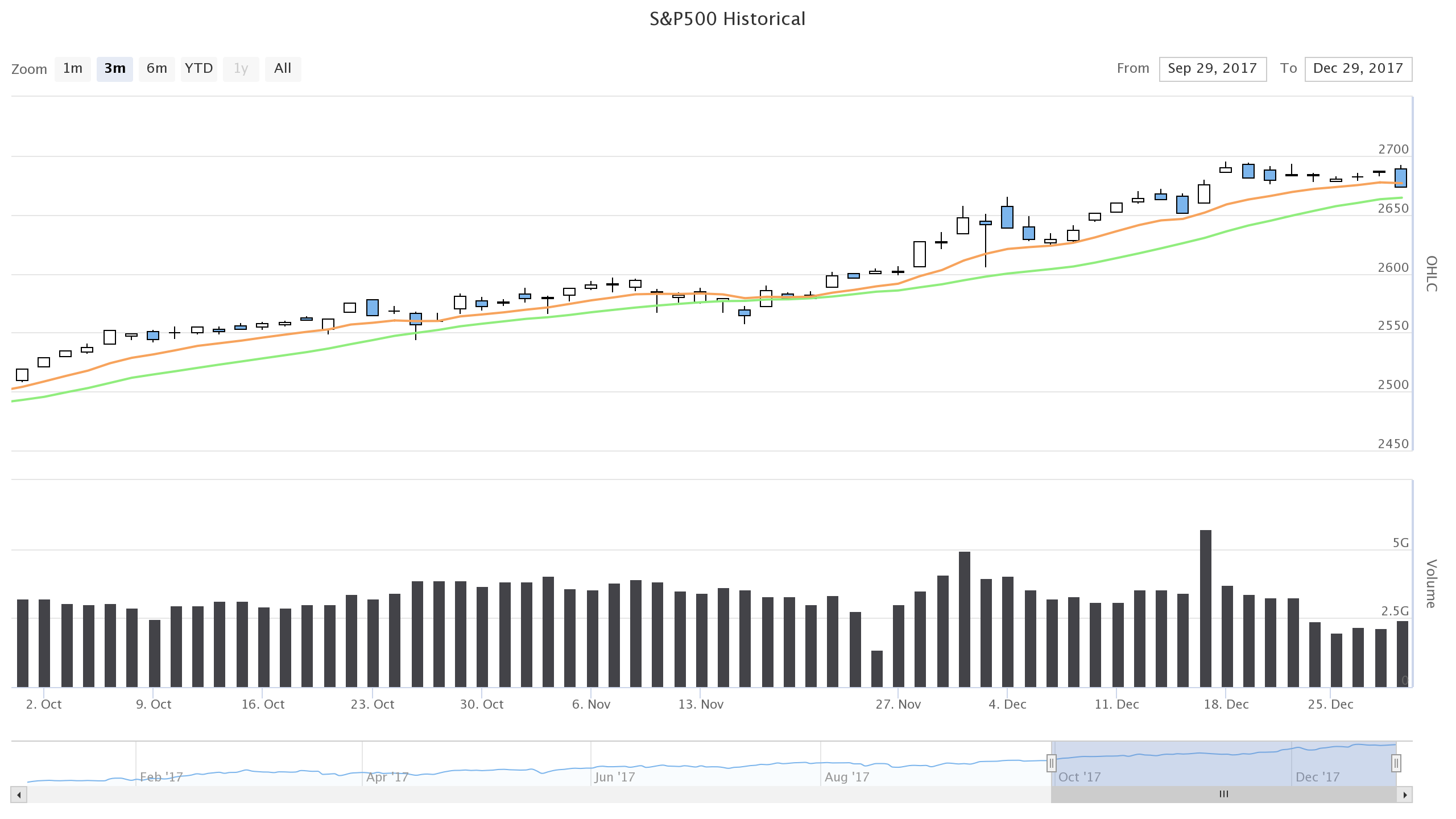
出来高とインディケーター
これらを一緒に表示してみました。
H = Highstock()

ohlc = [[x[0], r(x[1]), r(x[2]), r(x[3]), r(x[4])] for x in df2017.itertuples()]
volume = [[x[0], r(x[5])] for x in df2017.itertuples()]
sma = [[x[0], r(x[4])] for x in df2017.rolling(window=20).mean().itertuples()]
ema = [[x[0], r(x[4])] for x in df2017.ewm(span=10).mean().itertuples()]
options = {
    'rangeSelector': {
        'selected': 1
    },
    'title': {
        'text': 'S&P500 Historical'
    },
    'yAxis': [{
        'labels': {
            'align': 'right',
            'x': -3
        },
        'title': {
            'text': 'OHLC'
        },
        'height': '60%',
        'lineWidth': 2
    },
    {
        'labels': {
            'align': 'right',
            'x': -3
        },
        'title': {
            'text': 'Volume'
        },
        'top': '65%',
        'height': '35%',
        'offset': 0,
        'lineWidth': 2
    }],
    'chart': {
        'height': 720,
        'width': 1280,
    },
}

H.add_data_set(ohlc, 'candlestick', 'S&P500', dataGrouping={ 'units': groupingUnits })
H.add_data_set(volume, 'column', 'Volume', yAxis=1, dataGrouping={ 'units': groupingUnits })
H.add_data_set(sma, 'line', 'SMA (20)', dataGrouping={ 'units': groupingUnits })
H.add_data_set(ema, 'line', 'EMA (10)', dataGrouping={ 'units': groupingUnits })
H.set_dict_options(options)

H
options['chart'] でチャートの大きさを指定してみました。
オプションは Highcharts JS API Reference と同じように指定することができるので、リファレンスを参照しながらなんとなく使っていけそうです。
結果です。
終わり
通貨は出来高をあまり見ることがないですけれども、インディケーターの方は何か活用していけそうかなあ。
Gist に Jupyter Notebook のファイルをアップロードしておきました。