
2 軸のグラフを作りたかったので、試しに株価のラインと出来高のバーのグラフを作りました。
環境
- python 3.6.5
- matplotlib 3.0.2
Matplotlib について
2 軸のグラフは次のリンクが参考になりそうでした。
- Plots with different scales — Matplotlib 3.0.2 documentation
- matplotlib.axes.Axes.twinx — Matplotlib 3.0.2 documentation
その前に大切なことを知りました。
matplotlibにはグラフを作る際の二つの流儀がある
Artistの話の前に、新しいユーザーが絶対に知っておくべきplt.plotとax.plotの違いについて述べます。公式チュートリアルでも A note on the Object-Oriented API vs Pyplot や Coding Styles で言及されていますが、matplotlibでグラフを作るには二つの流儀(インターフェース)があります。公式ドキュメントを含めてネット上に大量にあるmatplotlibのコードにはこの二つが混在していますが、これらの違いについて明記してる例はあまり多くないように思えます。また、意味もなく二つを混ぜて使っている例も多く、これが多くの初心者のつまづきの原因になっていると思います。
違いを理解した上で Pyplot を使うのは良いとして、 the Object-Oriented API を使った方が柔軟にグラフを作っていけそうなので、こちらの方法を使って進めることにしました。
2 軸のグラフ
ここから Jupyter Notebook のセルに入力しながらグラフを作っていきたいと思います。 この中で使っているヒストリカルデータは Yahoo Finance の S&P500 のものです。
最初に、モジュールを読み込みました。
%matplotlib inline
import matplotlib.pyplot as plt
import numpy as np
import pandas as pd
次に、ヒストリカルデータを読み込みました。
df = pd.read_csv('~/Documents/1/historical-prices/^GSPC.csv', header=0, index_col=0, parse_dates=[0])
df.head()
df.tail()
1950 年からのヒストリカルデータだったので 2017 年だけ使うことにしました。
df2017 = df[df.index.year == 2017]
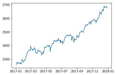
まず、株価のラインです。
fig, ax1 = plt.subplots()
ax1.plot(df2017.index, df2017['Close'])
結果です。
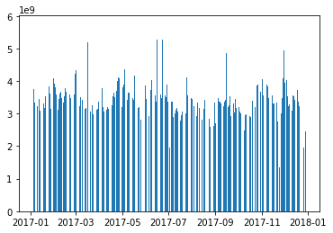
次に、出来高のバーです。
fig, ax1 = plt.subplots()
ax1.bar(df2017.index, df2017['Volume'])
結果です。
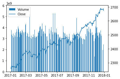
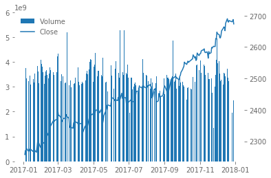
最後に、株価のラインと出来高のバーを一緒に表示しました。
fig, ax1 = plt.subplots()
ax2 = ax1.twinx()
c = ax1.bar(df2017.index, df2017['Volume'])
l = ax2.plot(df2017.index, df2017['Close'])
le = ax1.legend((c, *l), ('Volume', 'Close'), loc='upper left')
Axes.twinx() 関数は x 軸を共有した Axes を作ってくれるようです(こうすると y 軸が 2 つになります)。
legend は ax1 の方にまとめて表示するようにしました。
結果です。
style sheets
見た目の設定をしていて、次のリンクを見つけました。
style sheets と rcParams でカスタマイズできるみたいです。
最初に style sheets を試してみました。
モジュールを読み込んで、ヒストリカルデータを読み込んで、 2017 年のデータだけ用意しました。
%matplotlib inline
import matplotlib.pyplot as plt
import numpy as np
import pandas as pd
df = pd.read_csv('~/Documents/1/historical-prices/^GSPC.csv', header=0, index_col=0, parse_dates=[0])
df.head()
df.tail()
df2017 = df[df.index.year == 2017]
利用可能な style を表示してみました。
print(plt.style.available)
結果です。
['Solarize_Light2', '_classic_test', 'bmh', 'classic', 'dark_background', 'fast', 'fivethirtyeight', 'ggplot', 'grayscale', 'seaborn-bright', 'seaborn-colorblind', 'seaborn-dark-palette', 'seaborn-dark', 'seaborn-darkgrid', 'seaborn-deep', 'seaborn-muted', 'seaborn-notebook', 'seaborn-paper', 'seaborn-pastel', 'seaborn-poster', 'seaborn-talk', 'seaborn-ticks', 'seaborn-white', 'seaborn-whitegrid', 'seaborn', 'tableau-colorblind10']
次のようにするとスタイルを使うことができるようです。
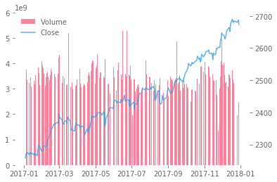
plt.style.use('ggplot')
グラフを作ってみました。
fig, ax1 = plt.subplots()
ax2 = ax1.twinx()
c = ax1.bar(df2017.index, df2017['Volume'])
l = ax2.plot(df2017.index, df2017['Close'])
le = ax1.legend((c, *l), ('Volume', 'Close'), loc='upper left')
結果です。
style sheets の方は予め決められたテンプレートのようなものがいくつかあって、そこから選択することでお手軽に見た目を変えられるようでした。 このテンプレートのようなものは自分で用意することもできるようでした。
rcParams
今度は rcParams を試してみました。
最初に、モジュールを読み込みました。
%matplotlib inline
import matplotlib as mpl
import matplotlib.pyplot as plt
import numpy as np
import pandas as pd
mpl を読み込みました。
plt.rcParams でもできるみたいですけれども、チュートリアルは mpl.rcParams だったのでそれに従いました。
次に、ヒストリカルデータを読み込んで、 2017 年のデータだけ用意しました。
df = pd.read_csv('~/Documents/1/historical-prices/^GSPC.csv', header=0, index_col=0, parse_dates=[0])
df.head()
df.tail()
df2017 = df[df.index.year == 2017]
設定可能な rcParams を表示してみました。
mpl.rcParams
結果です。
RcParams({'_internal.classic_mode': False,
          'agg.path.chunksize': 0,
          'animation.avconv_args': [],
          # …略…
          'ytick.minor.visible': False,
          'ytick.minor.width': 0.6,
          'ytick.right': False})
たくさんありましたので省略しました。
次のような設定にしてみました。
mpl.rcParams['axes.spines.bottom'] = False
mpl.rcParams['axes.spines.left'] = False
mpl.rcParams['axes.spines.right'] = False
mpl.rcParams['axes.spines.top'] = False
mpl.rcParams['legend.frameon'] = False
mpl.rcParams['text.color'] = '#666666'
mpl.rcParams['xtick.color'] = '#666666'
mpl.rcParams['ytick.color'] = '#666666'
グラフの枠を表示しないようにしました。 legend の枠を表示しないようにしました。 それからテキストの色を薄くしました。
グラフを作ってみました。
fig, ax1 = plt.subplots()
ax2 = ax1.twinx()
c = ax1.bar(df2017.index, df2017['Volume'])
l = ax2.plot(df2017.index, df2017['Close'])
le = ax1.legend((c, *l), ('Volume', 'Close'), loc='upper left')
結果です。
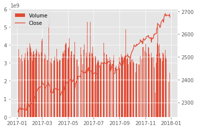
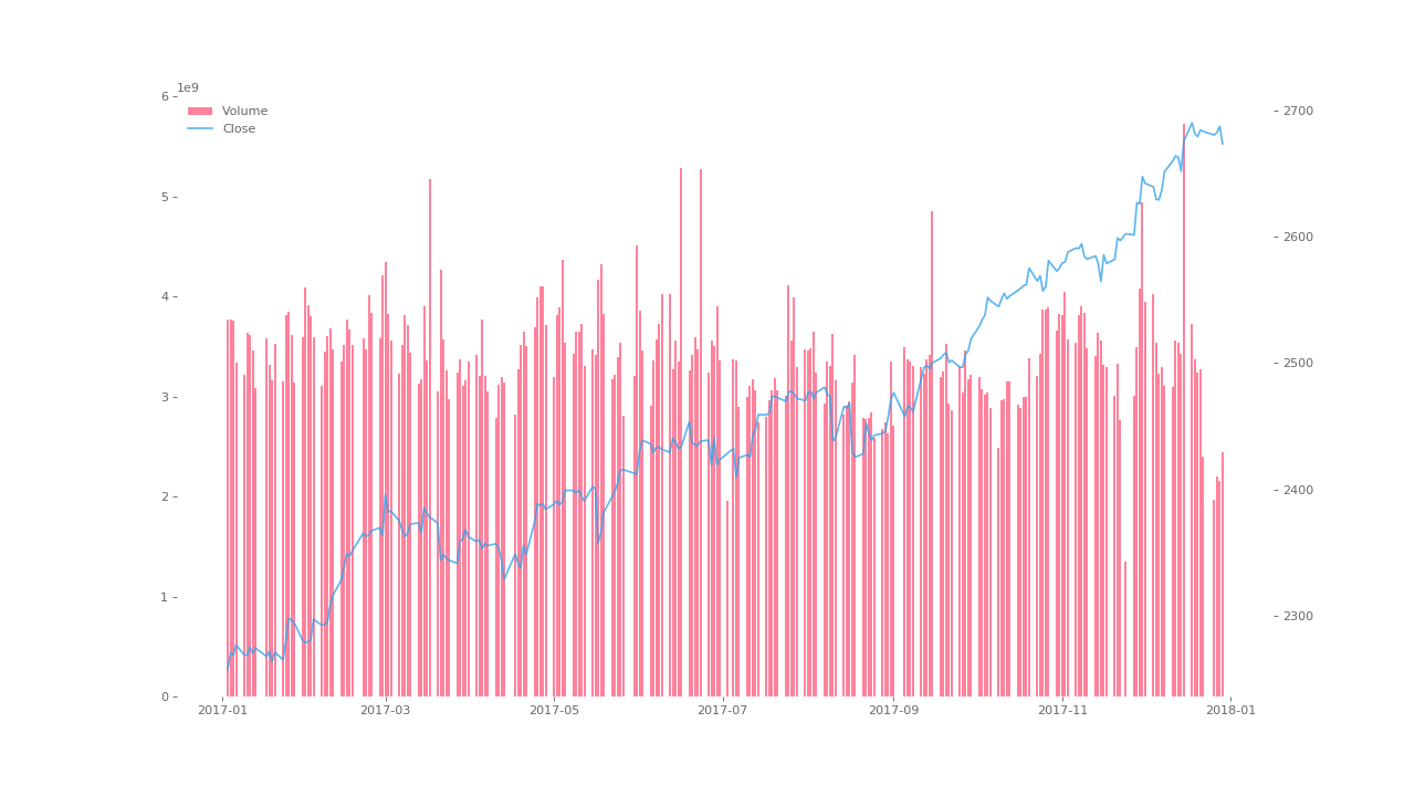
バーとラインの色も指定しました。
fig, ax1 = plt.subplots()
ax2 = ax1.twinx()
c = ax1.bar(df2017.index, df2017['Volume'], alpha=0.8, color='#ff6384')
l = ax2.plot(df2017.index, df2017['Close'], alpha=0.8, color='#36a2eb')
le = ax1.legend((c, *l), ('Volume', 'Close'), loc='upper left')
結果です。
この style sheets や rcParams を知る前は color なんかを毎回設定していたのですが、これは一度設定すると次も同じようなグラフが作れるので良さそうでした。
figsize, transparent
グラフのサイズを大きくしたいことがありました。
**fig_kw : All additional keyword arguments are passed to the pyplot.figure call.
figsize : tuple of integers, optional, default: None width, height in inches. If not provided, defaults to rcParams[“figure.figsize”] = [6.4, 4.8].
plt.subplots() 関数の figsize を指定することで変えられるようでした。
これは rcParams でも指定できるようでした。
それからグラフを透明にしたいことがありました。
transparent : bool
If True, the axes patches will all be transparent; the figure patch will also be transparent unless facecolor and/or edgecolor are specified via kwargs. This is useful, for example, for displaying a plot on top of a colored background on a web page. The transparency of these patches will be restored to their original values upon exit of this function.
Figure.savefig() 関数の説明です。
ファイルを保存するときに transparent に True を渡してあげればできるようでした。
グラフを作ってみました。
fig, ax1 = plt.subplots(figsize=(16, 9), dpi=80)
ax2 = ax1.twinx()
c = ax1.bar(df2017.index, df2017['Volume'], alpha=0.8, color='#ff6384')
l = ax2.plot(df2017.index, df2017['Close'], alpha=0.8, color='#36a2eb')
le = ax1.legend((c, *l), ('Volume', 'Close'), loc='upper left')
fig.savefig('png.png', dpi=80, transparent=True)
結果です。
終わり
Matplotlib について少し理解しました。
作った Jupyter Notebook のファイルを Gist にアップロードしておきました。